
Transform Your Business with Professional Graphic and Logo Design
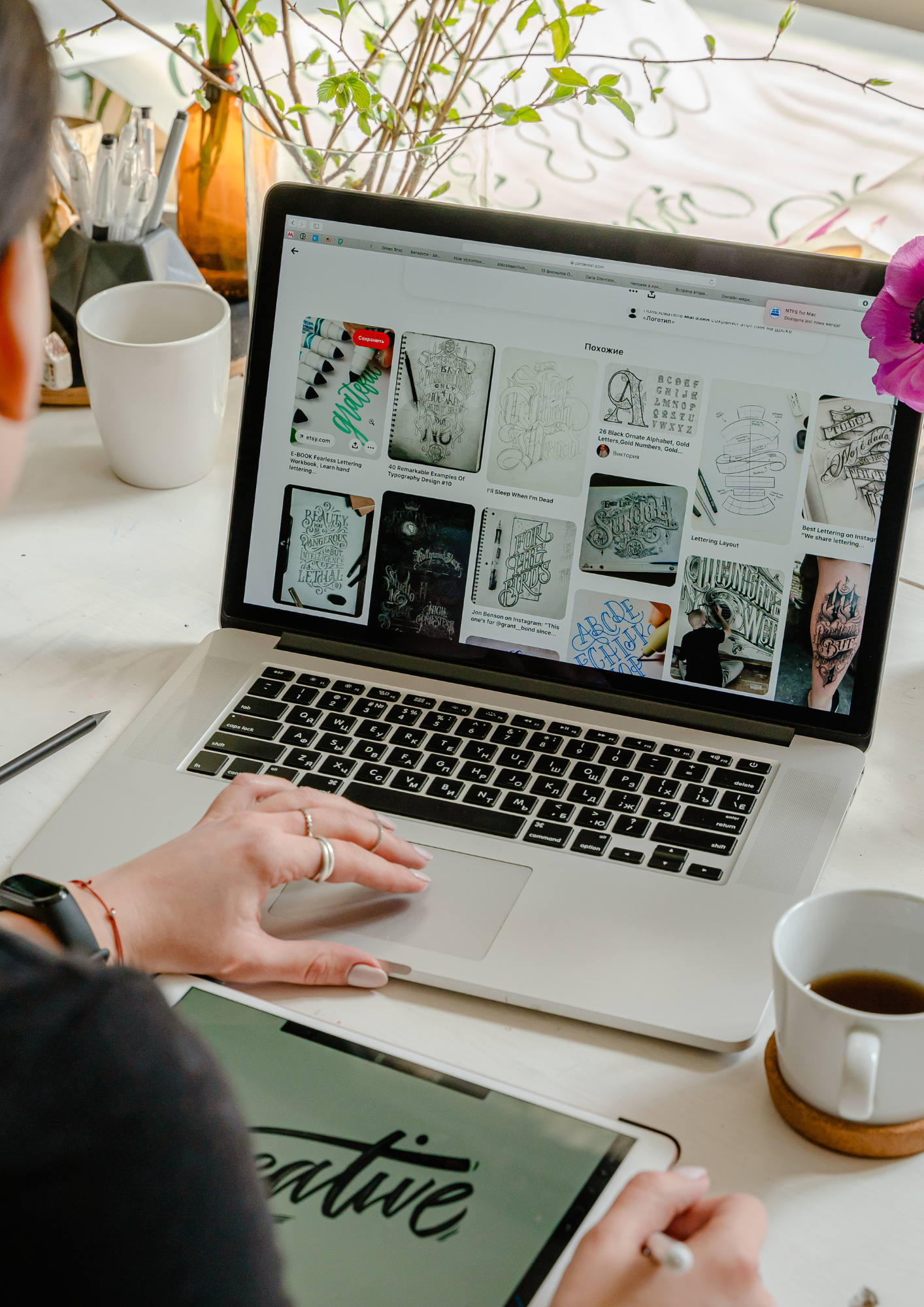
Your logo isn't a decoration — it's the first business decision a stranger makes about you before they ever read a word on your website.
Most service businesses treat design like an afterthought. They grab a $5 template off a stock site, slap their business name on it in a sans-serif font they vaguely recognize, and call it branding. Then they wonder why their conversion rate is flat, why customers don't remember them after a first visit, and why competitors with half their experience are charging twice as much. The answer is almost always visible before anyone opens their mouth.
Professional graphic and logo design isn't a luxury budget line. It's infrastructure.
Design Signals Price Before You Do
When a homeowner searches for a moving company or a med spa and lands on your site, they spend roughly 50 milliseconds forming a first impression — that's documented in research from Google and Carleton University. In that window, typography, color contrast, logo clarity, and visual hierarchy are doing all the talking.
A blurry logo with clashing colors tells a potential customer: *these people don't sweat the details.* If you're a plumber asking $350 for a service call, that signal costs you the job. If you're a medspa charging $1,200 for a laser package, it costs you the client and the referral that would've come with them.
Conversely, a well-designed visual identity — consistent brand colors, a clean mark that scales from a favicon to a vehicle wrap, professional typography that holds up in print and on mobile — signals competence before you've said a single word. It lets you charge what you're worth without having to justify it on every sales call.
What "Professional" Actually Means in Practice
Professional design isn't about spending $50,000 with a brand consultancy. It means your assets are built with intent and versatility.
Here's what that looks like concretely:
- A logo delivered in vector format (AI or EPS files), not a JPEG you screenshot from Canva. Vectors scale infinitely — your logo looks identical on a business card and a 10-foot trade show banner.
- A primary logo plus variations: horizontal lockup, stacked version, icon-only mark. A home services company needs that icon for app icons, van door magnets, and social profile images simultaneously.
- A defined color palette with hex, RGB, and CMYK values so your digital ads match your printed door hangers. Color inconsistency is one of the fastest ways to look unprofessional across channels without knowing why you look unprofessional.
- Typography hierarchy locked down — a headline font, a body font, and rules for how they sit together. Tools like Adobe Fonts or Google Fonts make this accessible even at smaller budgets.
A law firm rebranding from a generic serif logo to a custom wordmark with intentional negative space and a locked color system isn't just getting a new logo. They're getting a system that makes every future touchpoint — email signatures, proposal covers, courtroom presentations — look like one coherent entity.
The Compounding Return on Visual Identity
Businesses that invest in strong design once get leverage from it for years. Every ad you run, every piece of content you post, every vehicle you wrap — it all compounds on a solid visual foundation.
The inverse is also true. A weak visual identity forces you to spend more in other places. You compensate with heavier ad spend because organic trust is lower. You over-explain in your sales copy because the design isn't doing the pre-selling. You redesign every 18 months because the original work wasn't built to last.
A regional moving company that commits to a strong brand identity — a distinct logo, a consistent color system, professionally designed truck wraps and crew uniforms — stops competing on price and starts winning on perception. That's not theory. That's what happens when visual trust closes the gap between a quote and a signed contract.
What to Do Next
- Audit your current assets. Pull up your logo, website header, and most recent social post side by side. If they don't look like they came from the same company, you have a consistency problem that's costing you silently.
- Get your logo in vector format. If you don't have an AI or EPS file of your current logo, that's your first fix — everything else depends on it.
- List every surface your brand appears on. Business cards, vehicles, uniforms, email signatures, social profiles, Google Business profile. That list defines your design scope and tells you exactly what assets you need built.
- Brief a designer with outcomes, not aesthetics. Don't say "make it modern." Say "we charge premium rates to homeowners aged 35–55 and need to look like the obvious high-trust choice." That brief produces better work.
Design isn't what makes your business look good — it's what makes your business *feel* trustworthy to someone who doesn't know you yet, and that gap between stranger and client is where most service businesses either win or lose the sale entirely.
Want us to build this for you?
Get a free custom growth plan for your business.
Start Your Growth Plan